All work
ProjectTracker
UX/UI Redesign and Accessibility Improvements for an AI-Generated Project Management Platform.
UX/UI Redesign and Accessibility Improvements for an AI-Generated Project Management Platform.
1 Overview
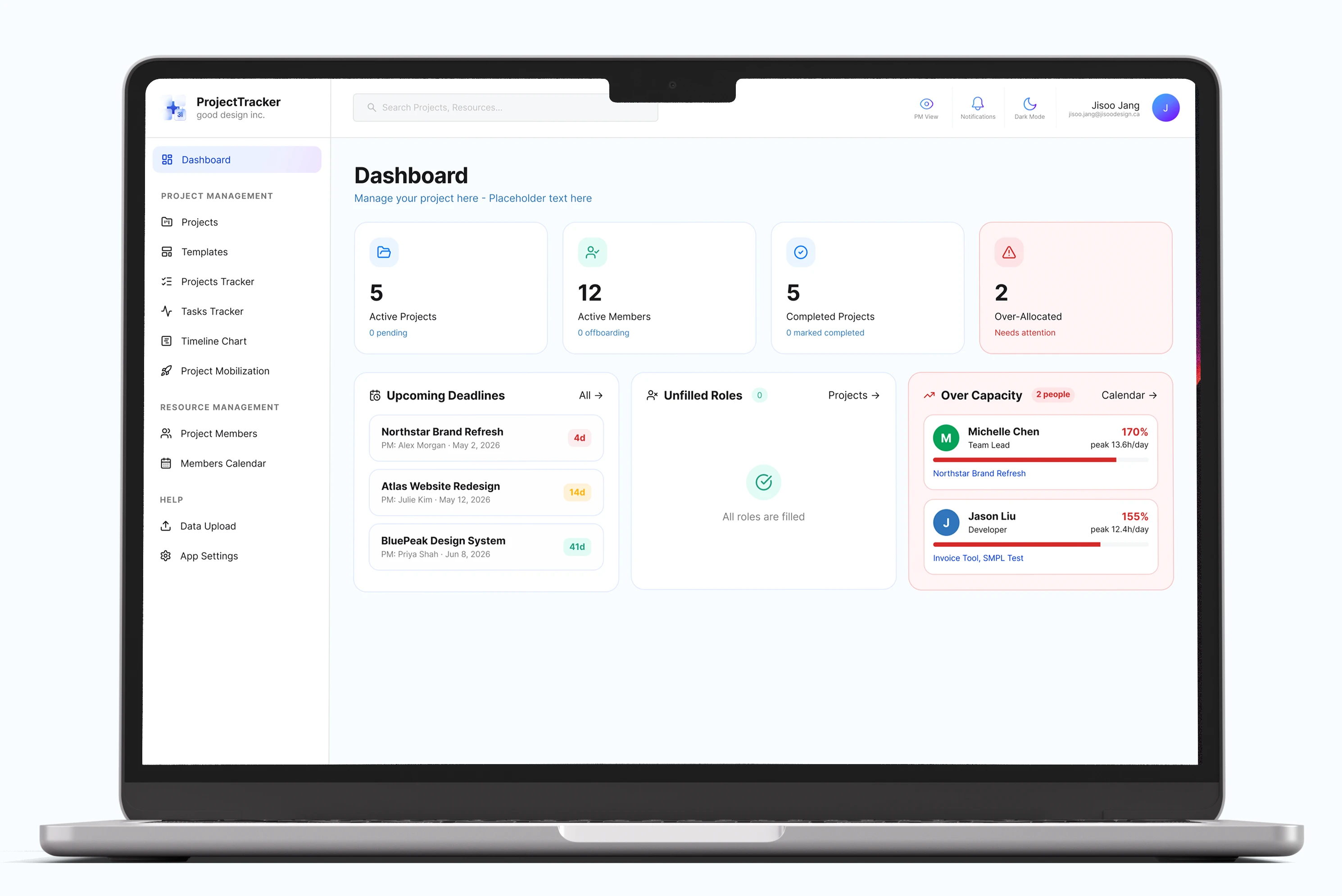
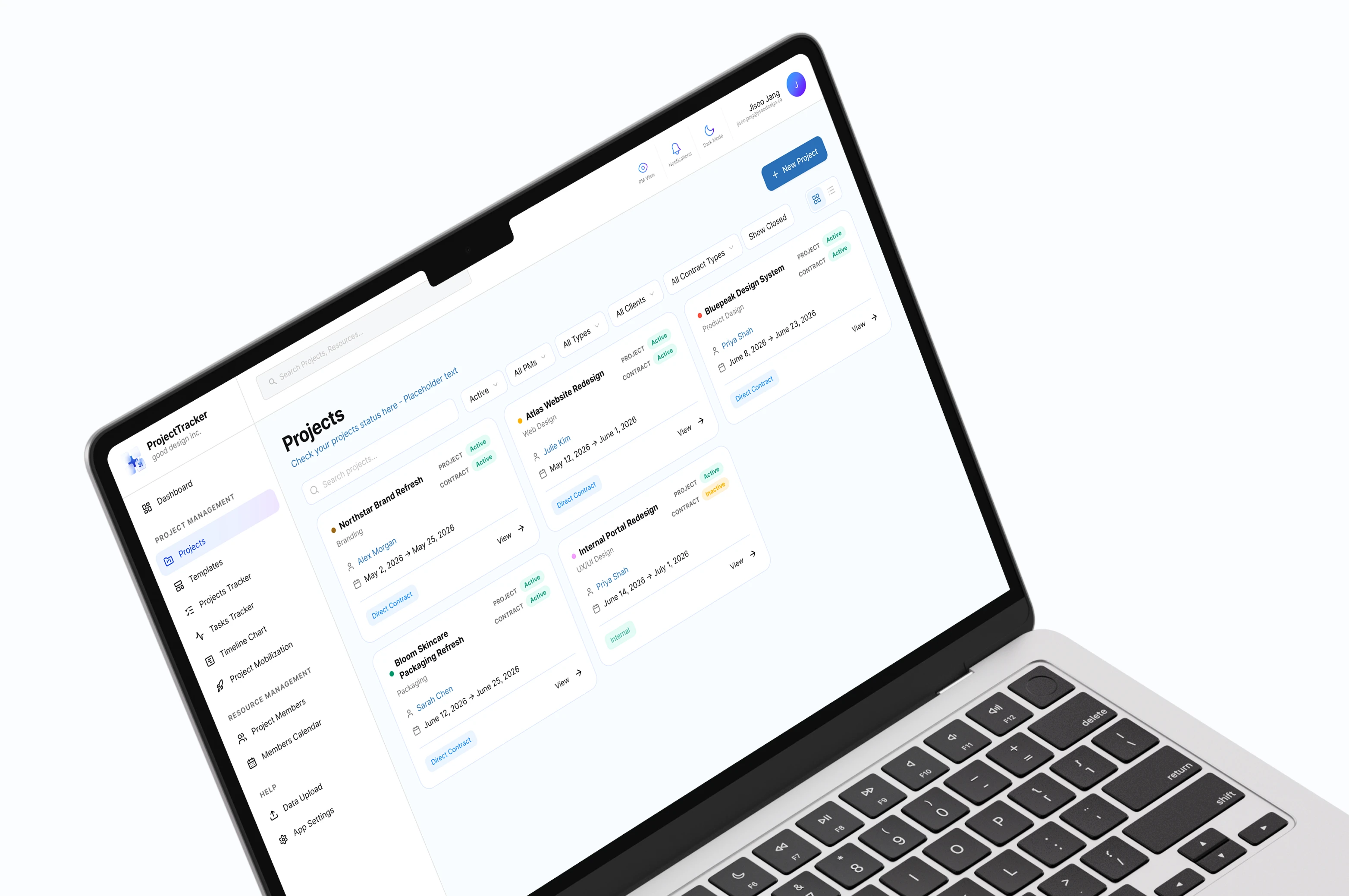
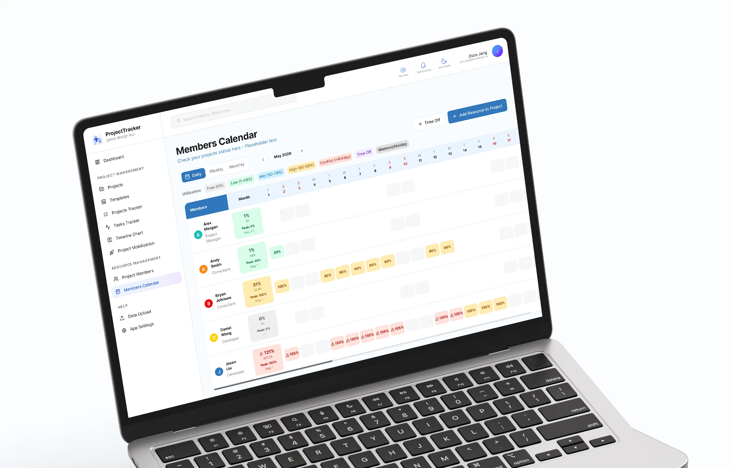
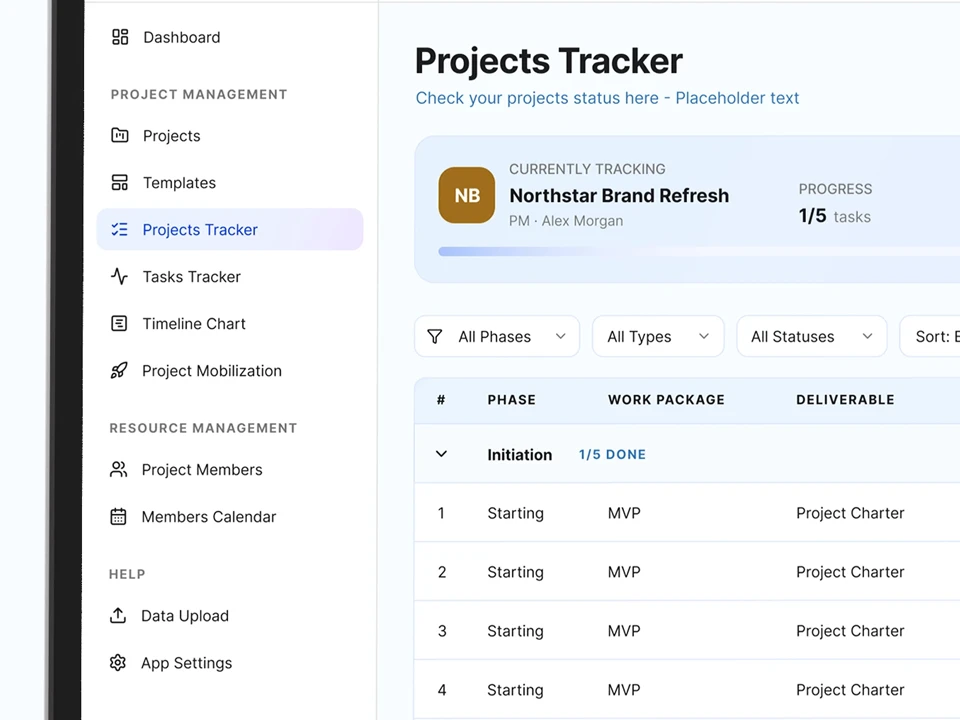
ProjectTracker is a project management platform created to help project managers and teams track projects, deliverables, activities, and timelines in one place.
The initial version of the ProjectTracker had already been created, especially UI/UX was generated by an AI design program. But the interface needed further refinement to better align with the company’s style guide and usability standards. My responsibility was to audit the existing platform, identify UX/UI issues, and redesign the interface and flow with a stronger focus on UI consistency, information hierarchy and accessibility.
This project focused on improving an existing AI-generated user interface and transforming it into a polished, cohesive, and user-friendly project management application.
2 Existing Product
The initial version of ProjectTracker was created by an AI design program as a project management platform for organizing projects, deliverables, and activities. The product was very functional and covered the core workflows, but further refinement was needed to better align with consistency and colour contrast standards. Also, the company's style guide and usability standards were not followed consistently.
The existing screens were recreated with placeholder content to protect confidential company information. Original colours, button styles, and layouts were preserved to accurately represent the initial product state.
3 Audit
After reviewing the existing product, I identified several UX/UI issues and accessibility concerns that needed to be addressed. I conducted a thorough audit of the product to understand the current state and identify areas for improvement.
1. Visual Inconsistency: The interface used inconsistent button styles, including variations in radius, size, and colour. Spacing, card styles, and visual treatments also differed across screens, making the product feel less cohesive as a system.
2. Poor Accessibility: Several colour combinations did not provide enough contrast for comfortable readability. For example, dark purple on black had a contrast ratio of 4.04, while light red on pink had a contrast ratio of 1.10. These low-contrast combinations made it harder to distinguish key information and interactive elements.
3. Cluttered User Experience: Some navigation paths and user flows were not intuitive. For example, as a project manager, smooth flow from Deliverable Tracker to the project's Activity Tracker should be important. But the flow from the Projects page to the Activity Tracker was unclear and tedious, which could make it harder for users to understand where to find related project activities.
Overall, the audit revealed three main areas for improvement: creating a more consistent visual system, improving colour contrast for accessibility, and clarifying key user flows across the platform.
4 Opportunities
I found 4 main opportunities for improvement: creating a more consistent visual system, improving colour contrast for accessibility, and clarifying key user flows across the platform.
01. Create a Cohesive Visual System
02. Improve Accessibility
03. Strengthen Information Hierarchy
04. Simplify User Flows
5 Design Strategy
The redesign focused on transforming the existing product into a cohesive and scalable design system while improving accessibility and clarifying key workflows across the platform.
01. Establish a Design System
02. Improve Accessibility Standards
03. Enhance Workflow Clarity
6 Key Improvements
Before
After
1. Visual Consistency
Before
After
2. Accessibility Improvements
Before
After
3. Workflow Clarification
Before
After
4. Improved Information Hierarchy
Before
After
5. Simplified User Flows
7 Final Outcome
The redesign resulted in a more cohesive and accessible interface supported by a consistent design system and clearer workflows. Although the prototype is not fully functional, it demonstrates the core interactions and redesigned experience across the platform.
8 Key Learnings & Reflection
AI-generated interfaces could not always be intuitive, consistent, or accessible. This project became a perfect opportunity to explore where human judgment and design thinking are still essential in shaping meaningful user experiences.
By evaluating an existing AI-generated product, identifying its weaknesses, and systematically improving it, I learned that refining an existing experience can be just as impactful as creating a new one from scratch. I also gained a deeper appreciation for design systems and how consistency in colours, components, and spacing directly influences scalability and the overall user experience.
Key Learnings 1: Improving existing products can be as valuable as creating new ones.
Effective design often comes from evaluating what already exists, identifying opportunities for improvement, and making thoughtful, systematic changes.
Key Learnings 2: Consistency is essential for scalable products.
Working across multiple screens reinforced the importance of design systems and how consistent colours, components, and spacing contribute to a more cohesive experience.
Key Learnings 3: Accessibility should be considered from the beginning.
Applying colour contrast standards and improving visual hierarchy showed me that small design decisions can have a meaningful impact on usability and readability.
As my first real-world product design project outside of school, ProjectTracker helped me understand how design decisions affect not only the visual quality of an interface, but also workflow clarity, scalability, and team productivity.
Working on an internal enterprise platform taught me to think beyond individual screens and consider how each component, flow, and interaction supports a larger system. This experience strengthened my interest in designing scalable digital products and will continue to shape how I approach product design in my future career.
Next project